Crashmap: Difference between revisions
imported>Heather Drugge No edit summary |
imported>Heather Drugge No edit summary |
||
| Line 20: | Line 20: | ||
[[File:Lower Mainland Crash Fatalities Actuals.png|600px|left]] |
[[File:Lower Mainland Crash Fatalities Actuals.png|600px|left]] |
||
*Taking all of BC into consideration, the per 100,000 death rate for people in vehicles is 6.3. |
*Taking all of BC into consideration, the per 100,000 death rate for people in vehicles is 6.3. |
||
* |
*The per 100,000 death rate for people on bikes is .44. |
||
*By comparison, the death rate for the flu per 100,000 is 1.8. |
*By comparison, the death rate for the flu per 100,000 is 1.8. |
||
Revision as of 18:53, 23 March 2021
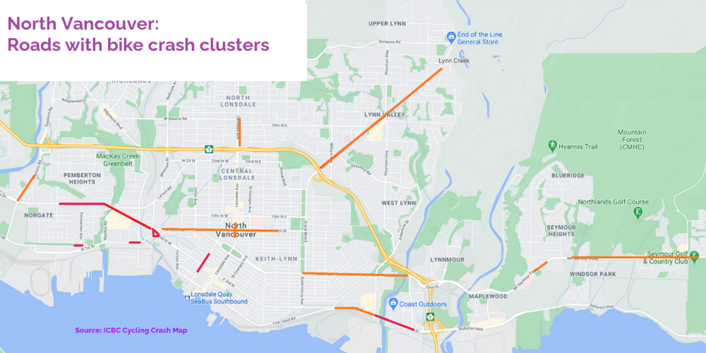
This map illustrates bike crash information from the ICBC website. ICBC counted the crashes involving people on bikes for five years, from 2015 to 2019. Red indicates multiple crashes in the same space. Orange indicates fewer crashes along a route. The pdf file below includes actual counts at different locations. Marine Drive and Main Street are high injury locations. No surprises there. But so was lower Chesterfield, which is surprising. The .pdf file below lists all the locations where crashes took place in North Vancouver.
File:Crash Locations - North Van.pdf
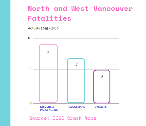
The next chart shows the number of people killed in crashes by transportation type in North Vancouver and West Vancouver for the same 2015-2019 period.
24% of people killed in crashes were people on bikes.

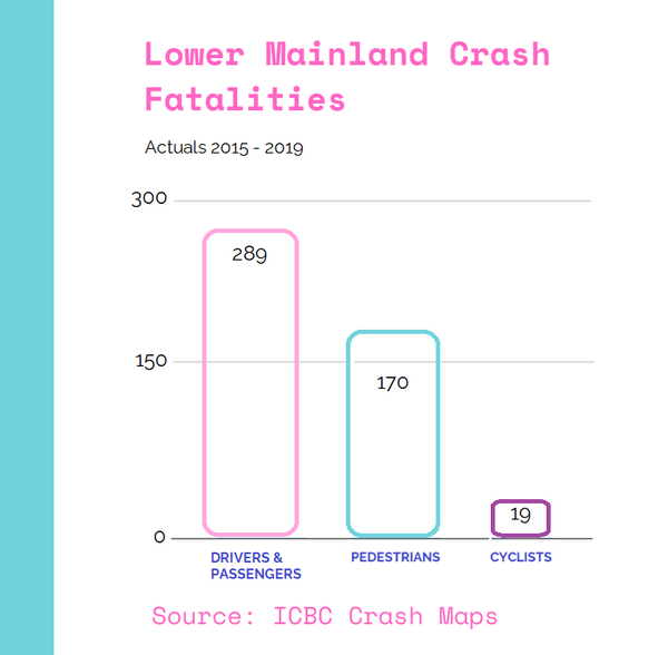
The chart below shows the number of people killed in crashes by transportation type in the Lower Mainland for 2015-2019. 4% of people killed in crashes were people on bikes.
- Taking all of BC into consideration, the per 100,000 death rate for people in vehicles is 6.3.
- The per 100,000 death rate for people on bikes is .44.
- By comparison, the death rate for the flu per 100,000 is 1.8.

